Robert M. Bruckner
September 2006
Applies to:
Microsoft SQL Server 2005 Reporting Services
Summary:
This white paper presents general information, best practices, and tips
for designing charts within Microsoft SQL Server Reporting
Services reports. It provides an overview of some Reporting Services
features, answers common chart design and feature questions, and
includes advanced examples of how to design better charts. (32 printed
pages)
Click here to download the associated sample code,
GetMoreChartsSamples.exe [ http://download.microsoft.com/download/e/8/b/e8b42814-6a0c-40eb-911f-e7adec87f5d5/getmorechartssamples.exe ] .
Click here to download the Word version of this article,
MoreSSRSCharts.doc [ http://download.microsoft.com/download/f/1/c/f1cf7b8d-7fb9-4b71-a658-e748e67f9eba/moressrscharts.doc ] .
Contents
Introduction
Data Preparation
Chart Labels
Example Charts and Reports
Conclusion
Introduction
This
white paper covers how to design charts in Microsoft SQL Server
Reporting Services reports. The paper is divided into several sections
and references specific report examples; these are included in the
sample project download.
The first section, Data Preparation, covers specific information, tips, and insights about preparing the data. The second section, Chart Labels, tells you how to apply label settings to enhance your charts and control visual appearance and effects.
Example Charts and Reports
shows specific and sometimes advanced examples of how to get more out
of the built-in chart functionality of SQL Server Reporting
Services. Some of these examples require careful study of the provided
step-by-step instructions. Fully working sample reports are included
for your convenience. The sample reports are based on the
SQL Server 2005 AdventureWorks sample database and the
Northwind sample database.
The information on data preparation
and chart labels helps you to better understand the examples. You may
find it useful to occasionally jump back to the specific chart label
topics covered in the first sections while studying the samples.
Data Preparation
A
chart provides a way to visualize data. It can more effectively convey
information than can lengthy lists of data. Spending time carefully
preparing and understanding your data before you create a chart will
help you design your charts quickly and efficiently. Reporting Services
chart data is organized into three areas: values, category groups, and
series groups. For detailed information, see
Working with Chart Data Regions
[ http://msdn2.microsoft.com/en-us/library/ms155847.aspx ] ) in the
SQL Server Reporting Services section of SQL Server 2005
Books Online.
A chart is very similar to a matrix:
- A chart category group is equivalent to a matrix column group.
- A chart series group is equivalent to a matrix row group.
- A chart value is equivalent to a static matrix row group.
- A chart data value or data point is equivalent to a matrix cell.
Keep the following points in mind when preparing the dataset query for a chart:
- Chart values are shown along the numeric y-axis. Make sure the fields used as values have numeric data types (as opposed to strings that contain formatted numbers).
- X-axis
values are determined based on the chart categories group values or the
group labels if group labels are explicitly defined. The x-axis
supports two modes (discussed in detail in X-Axis Category Mode and Scalar Mode). If you want to use the x-axis scalar mode, make sure that the fields and/or expressions used for the category group expression evaluate to a numeric data type or to a DateTime object.
- You
can have as many charts in your report as you need. A chart, like any
other data region such as a matrix or table, is bound to one particular
dataset. You can use joins and union in the dataset query to include
all the needed data in the dataset.
- If a chart is placed in a
table group header or group footer, or in a matrix cell, the data
passed to the chart control is restricted to the subset of data that
constitutes that group. A chart cannot be placed in the detail row of a
table, as only one data row is referenced.
- A chart with too
much data (for example, several thousand data points) may be difficult
to interpret unless you use a scatter chart to show the distribution of
values and clusters of data points. Consider pre-aggregating data in
the dataset query if a detailed level of data granularity is not
necessary or not useful.
Chart Labels
This
section covers the following chart label topics. You may find it useful
to occasionally jump back to the topics covered in this section when
you study the samples in the next section.
- X-axis category mode and scalar mode
This section explains the significant differences between the two x-axis modes. You can use the CategoryAxisSettings sample report as a starting point for experiments.
- Axis labels
The axis labels section dives deep
into the details of applying label settings and how they impact the
visual appearance of the chart at run time.
- Data point labels and legend labels
This section tells you how to improve your charts by adding data point labels and legend labels.
X-Axis Category Mode and Scalar Mode
The x-axis has two modes. The mode is set by using the Numeric or time-scale values option on the X Axis tab in the Chart Properties dialog box.
- Category mode
The category group
expression values determine the individual categories for the x-axis.
Labels are shown for only the actual categories present in the data.
The sort order within a group and explicit sort expressions are
important in category mode, as the chart control will not reorder
categories. The format code defined for the x-axis is applied only if
the group expression (or the group label expression if explicitly
defined) evaluates to a nonstring object.
Grouping spans for categories are shown if you have multiple levels of category groupings.
- Scalar mode
The x-axis value range is
determined by the minimum and maximum category group expression values.
Consequently, the group expression values must be numeric or DateTime values in order to compare and sort. Gaps in the data (for example, you use a DateTime
category grouping and you only have data for July and September) are
shown on the x-axis, as the categories are scaled either to a numeric
or a DateTime axis. Only one category grouping is allowed in scalar mode.
The charts in Figures 1A and 2A show the same four weeks of order data.
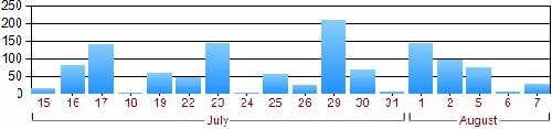
Figure 1A. X-axis in category axis mode and grouping spans
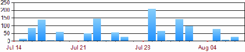
Figure 2A. X-axis in scalar mode
The Category Axis Mode in Figure 1A
Since
there is no order data for the weekend days (Saturday, Sunday) in the
underlying dataset, the categories are not present in Figure 1A.
The example uses two category groupings, as shown in Figure 1B.
The inner group expression uses =Day(Fields!OrderDate.Value) to group per day. The outer group expression uses =Month(Fields!OrderDate.Value) to group per month.
Note The outer group label expression is defined as =MonthName(Month(Fields!OrderDate.Value)), which uses the month name as the label for the grouping span.
 [ http://msdn2.microsoft.com/en-us/library/aa964128.moressrschartsfig01b(en-us,sql.90).gif ]
Figure 1B. X-axis in category axis mode with multiple category groupings and spans (Click on the image for a larger picture)
The
settings for the x-axis properties are shown in Figure 1C. In
category mode, the semantics of minimum, maximum, and intervals are
based on the category index. By not specifying any explicit axis properties, one label is shown for every category of data.
 [ http://msdn2.microsoft.com/en-us/library/aa964128.moressrschartsfig01c(en-us,sql.90).gif ]
Figure 1C. X-axis settings for category axis mode (Click on the image for a larger picture)
The Scalar Axis Mode in Figure 2A
An x-axis in scalar mode shows either numeric or DateTime
values. The x-axis covers the full range of values between the minimum
and the maximum values. Consequently, Figure 2A contains gaps for
the weekend days because they do not have order data.
Only one
category grouping is allowed when using the x-axis in scalar mode. The
value of the category grouping must evaluate to a numeric or DateTime
value. The formatting of the x-axis labels is determined by the format
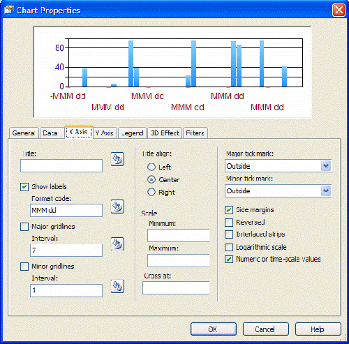
string setting on the x-axis—in this example, MMM dd. The settings for
the x-axis properties are shown in Figure 2B.
 [ http://msdn2.microsoft.com/en-us/library/aa964128.moressrschartsfig02b(en-us,sql.90).gif ]
Figure 2B. X-axis settings in scalar mode (Click on the image for a larger picture)
For more information on numeric and DateTime format strings, see the following pages in the .NET Framework Developer's Guide on the Microsoft Developer Network (MSDN):
Axis Labels
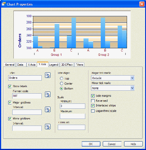
Y-axis labels are always based on numeric values. If explicit axis settings are not specified, the y-axis uses the auto-scale mode as follows:
- The y-axis minimum value is determined based
on the lowest y-value of all data points. If that minimum data value is
not an integer value but a double value (such as 3.75) and side margins
are turned off, you may see y-axis labels that are not rounded
to full numbers (for example, with an interval of one: 3.75, 4.75,
5.75, and so on).
- The y-axis maximum value is automatically
determined based on the highest y-value of all data points unless the
maximum is explicitly specified.
- The y-axis major interval is
automatically determined based on the data values (in Figure 3 the
automatic major interval is 20).
- The y-axis minor interval
divides the major interval into segments (in Figure 3 the
automatic minor interval would be 4; hence
20 / 4 = 5 minor interval segments constitute one
major interval segment).
- Since y-axis values are always numeric, you can directly apply
numeric format strings [ http://msdn2.microsoft.com/en-us/library/aa720653.aspx ] . The setting is applied to all generated y-axis labels.
 [ http://msdn2.microsoft.com/en-us/library/aa964128.moressrschartsfig03(en-us,sql.90).gif ]
Figure 3. Y-axis settings (Click on the image for a larger picture)
X-Axis Modes
As
discussed in the previous section, the X-axis has several modes.
Depending on the mode, different options for formatting are available
and the axis settings (Minimum, Maximum, Cross at, and so on) may be interpreted differently. Following are descriptions of the different formatting options:
- Scalar mode based on numeric category group values
With these settings, the x-axis is very similar to the y-axis. Axis settings such as Minimum, Maximum, Cross at, Major interval, and Minor interval are interpreted as integer or double values.
Since the x-axis values are numeric, you can directly apply
numeric format strings [ http://msdn2.microsoft.com/en-us/library/aa720653.aspx ] .
- Scalar mode based on DateTime category group values
Axis Minimum:
If the axis minimum is set to a constant (such as 2005) or an
expression with an integer result (for example, =2005), the value is
interpreted as the first day in that year (such as Jan 1st, 2005).
Axis Maximum: An integer setting is interpreted as the last day in that year (such as Dec 31st 2005).
Axis Cross at: The setting is interpreted as the middle of the year.
Major interval and Minor interval: The interval settings are interpreted as days (equivalent to the OADate format). For example, 5 means an interval of 5 days and 0.5 means an interval of half a day (12 hours).
For the label formatting, you can directly apply standard
DateTime format strings [ http://msdn2.microsoft.com/en-us/library/aa720651.aspx ] .
- Category mode (the Numeric or time-scale values option is not selected)
Based
on the category group expression values, the chart control matches
categories across multiple series (for example, data for the January
category in the 2006 series will be in the same cluster as data
for the January category in the 2007 series).
Format string settings on the X Axis tab have no effect unless the category group expression (or label expression as in Figure 4) evaluates to a numeric or DateTime
data type. Often when you use category mode, the category group
expression evaluates to a string object, hence a format code applied
later has no effect. You can either add or change the category group
label expression or apply the formatting directly through the label
expression, as shown in Figure 4.
Note In category mode, the semantics of minimum, maximum, and intervals are based on the category index.
For instance, setting the x-axis minimum to 2 means the first category
of data will not be shown. Setting the major interval to 5 means that
labels are shown only for every fifth category on the x-axis. This can
be useful if the x-axis is crowded with many categories (and labels)
and the underlying semantics of the categories are actually numeric.
Note Reporting Services 2005 also allows expressions in all the input fields shown in the X Axis and Y Axis tabs: Title, Minimum, Maximum, Major interval, Minor interval, and so on.
Figure
4. If the label expression is explicitly defined, the result is shown
on the x-axis (category axis) instead of the result of the group
expression.
Axis Label Formatting Q&A
- Question (Y-axis): How can I enforce "nice" integer-based labels on the y-axis?
Answer: If no axis settings are specified, the chart control
automatically determines the values based on the data point y-values.
If the minimum/maximum values of the data points are not integers, the
y-axis labels may use double values.
If, however, at least one of the axis settings (for example, Minimum or Cross at)
is explicitly specified as an integer value by the report author, the
chart control rounds the automatically detected values to the nearest
integer value and then shows "nice" labels. For instance, you could
dynamically set the y-axis minimum value and apply rounding like this: =Floor(Min(Fields!Freight.Value)).
- Question (Scalar x-axis): Turning on Numeric or time-scale values results in the chart not showing any data points at runtime. What is wrong?
Answer: Most likely the category group expression evaluates
to a string instead of to numeric values. Change the category group
expression accordingly. If you don't want to change the query to fetch
scalar data values instead of string values, you can also perform the
type conversion in the report by using Microsoft Visual Basic functions
such as CInt(), CDbl(), or CDate().
- Question (Category x-axis): If the number of
categories increases, the x-axis becomes crowded and eventually axis
labels are no longer drawn. How can I control the number of labels in
the category mode of the x-axis?
Answer: The chart control tries to automatically position
x-axis labels to avoid overlapping the label text. By default, every
category has a label on the x-axis. You can explicitly set the x-axis
major interval setting to override this default behavior. For instance,
setting the major interval to 5 shows labels for every fifth category
only.
- Question (X-axis): How does automatic x-axis label positioning work?
Answer: Currently, built-in Reporting Services charts only
allow automatic positioning in order to avoid overlapping the x-axis
labels. The label direction (horizontal/vertical) of the axis labels
depends on the label string sizes and the available space. X-axis
labels are either shown horizontally in one line, horizontally in
multiple lines with line breaks, or vertically. Showing x-axis labels
at an angle, or explicit manual control over individual x-axis label
positions is currently not supported.
Note There
are several third-party chart add-ins that enable more control over
axis labels. These add-ins can be installed on top of Reporting
Services 2005.
Data Point Labels and Legend Labels
Data
point labels can be used to specifically point out certain values (such
as the overall minimum or maximum value) among all visible data points
in the chart.
To turn on data point labels, edit the chart value in the Chart Properties dialog box. This opens the Edit Chart Values dialog box, which contains a Point Labels tab with the Show point labels option.
Positioning Data Labels
When
you turn on data point labels, by default one label per data point is
shown. The data point label is positioned automatically to avoid
overlapping the labels. If data point labels overlap, the chart control
moves overlapping labels into a free space of the chart plot area (and
draws outlines to connect data point labels to data point values). If
too many labels overlap, the chart control removes individual data
point labels until there is enough space to fit the remaining labels
without overlapping.
Besides automatic positioning, you can use explicit manual label positioning
(top, left, center, and so on). However, depending on the data values
and the length and size of the data point labels, this may result in
overlapping labels.
By default, the data point label shows the
y-value of the data point. It is also possible to specify an explicit
data point label expression and numeric or DateTime format
strings to customize the label. In general, you would perform data
point label calculations using expressions similar to those used to
calculate the y-value in the data point value expression. For instance,
to show only data point labels if the relative contribution of that
segment is larger than 5 percent of the total amount, you could use a
data point label expression similar to the code in the following
procedure.
- Use the following expression for the data point label expression:
=Code.GetLabel(Sum(Fields!Sales.Value), Sum(Fields!Sales.Value,"SalesChart"))
- Open the Report Properties dialog box and click the Code tab. Add the following GetLabel(…) custom code function in the Custom code option.
Public Function GetLabel(ByVal currentValue As Double, ByVal totalValue As Double) As String
    If currentValue / totalValue < 0.05 Then
        Return " "
    Else
        Return Format(currentValue / totalValue, "P1")
    End If
End Function
Explanation of the Code
The GetLabel()
function takes two arguments. The first argument provides the current
value for that particular data point. The second argument provides the
calculation of the total amount. The function calculates the relative
percentage. If it is lower than 5 percent (0.05), a string with a blank
is returned.
Note Returning
a null or an empty string shows the auto-generated default label. If
the relative percentage is at least 5 percent, a percentage formatted
string (format string: P1) is returned.
An example for applying this kind of formatting can be found in the PiePercentage sample report included with this white paper.
Pie and Doughnut Charts Data Label Positions
For pie and doughnut charts there are only two data point label positions: inside (set the data point label position to Auto or Center), and outside (any other label position). An example of outside labels is shown in Figure 5 (and in the PieSimplePercentage sample report).
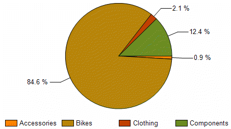
Figure 5. Data point labels outside the chart in a pie chart
The position of pie segment labels can be specified as shown in Figure 6.
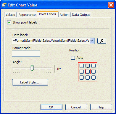
Figure 6. Setting data point labels outside the chart in a pie or doughnut chart by selecting any position except the center one
Legend Labels
In
general, legend labels are determined based on dynamic series group
values (or labels if explicitly specified on the group) and the names
of (static series) values. Since the chart is essentially a flattened
representation of grouping hierarchies, legend labels are generated
based on that hierarchy.
For example, if a chart has two
series groupings (the outer defined as OrderYear, the inner as
OrderQuarter) and only one chart value (for example, Actual), the
legend labels are generated by concatenating the group values and chart
values as shown in table 1.
Table 1
| OrderYear label | OrderQuarter label | Chart value series label | GENERATED LEGEND LABEL |
| 2006 | Q1 | Actual | 2006 – Q1 – Actual |
| 2006 | Q2 | Actual | 2006 – Q2 – Actual |
Suppose
we add a second chart value called Budget. With the same data as the
previous example, the generated labels look like those in table 2.
Table 2
| OrderYear label | OrderQuarter label | Chart value series label | GENERATED LEGEND LABEL |
| 2006 | Q1 | Actual | 2006 – Q1 – Actual |
| 2006 | Q1 | Budget | 2006 – Q1 – Budget |
| 2006 | Q2 | Actual | 2006 – Q2 – Actual |
| 2006 | Q2 | Budget | 2006 – Q2 – Budget |
Note You can hide individual inner levels in the hierarchy by setting the group label expression to return an empty string (=""). This removes that group level from the generated legend labels.
Empty Data Points and Labels
The
following situation may sound familiar. You build a chart with one data
series, data point labels are turned on, and the chart looks great. You
decide to add a dynamic series group so that the chart shows multiple
data series. Suddenly the chart has additional labels (for empty data
points).
Empty data points occur when the underlying
dataset does not contain data values for every series/category
combination. The chart is essentially equivalent to a (sparse) matrix
with empty cells.
You can remove labels for empty data points.
Instead of turning on the data point labels and using the default
label, use the approach shown in the EmptyDataPointLabels sample report included with this white paper (see also Figure 7). Following is sample code that does this.
- Use the Count(…) function to
determine how many underlying dataset rows are aggregated for this data
point. If the count equals zero, this is an empty data point. Pass in
the count to a custom code function with the actual label value:
=Code.GetLabel(Avg(Fields!UnitsInStock.Value), Count(Fields!UnitsInStock.Value))
- Open the Report Properties dialog box and click the Code tab. Add the following GetLabel(…) custom code function in the Custom code option.
Public Function GetLabel(ByVal datapointValue As Double, ByVal count As Integer) As String
    If count = 0 Then
        Return " "
    Else
        Return Format(datapointValue, "N1")
    End If
End Function
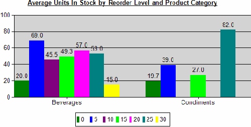
Figure 7. Sample report that has empty data points without labels
Data Point Label Formatting Q&A
- Question: What's the purpose of the gray lines (called outlines) near data point labels if the chart is crowded with data points and labels?
Answer: If the data point label position is set to Auto,
the chart control moves labels into areas of free space to avoid
overlapping data point labels. The outlines connect the data point
label with the data point location.
You can use the manual positioning to avoid this. By using
expressions, you can dynamically hide most data point labels by
providing an evaluation result of a string with a blank (=" "). Otherwise, the default label is shown if data point labels are turned on.
- Question: Is it possible to use Dundas keywords for label formatting?
Answer: Yes, you can use built-in Dundas keywords for the
data point label. However, in general it is recommended that you not
combine RDL expressions and Dundas keywords at the same time (RDL
expressions are evaluated first, Dundas functions are interpreted by
the chart control later). Table 3 contains a list of useful Dundas
keywords.
Table 3
| Dundas keyword | Replaced with |
| #VALX | X-value of the data point |
| #VAL | Y-value of the data point |
| #VALY, #VALY2, #VALY3, etc. | First y-value, second y-value, third y-value, and so on |
| #INDEX | Data point index within series |
| #TOTAL | Total of all y-values in the current series |
| #VALY{C2} | Y-value of the data point formatted with the C2 format string (currency formatting) |
Example Charts and Reports
This
section contains examples of creating different types of charts and
reports. You may find it useful to occasionally jump back to the chart
label topics covered in the previous sections when you study these
examples. Following are the examples covered in this section.
- Column and Line Hybrid Charts
Describes combinational charts in general and the SalesCostTarget sample report.
- Pareto Charts
Implements a Pareto visualization for a chart (ParetoChart sample report).
- Moving Average Calculations
Calculation and visualization of time-series trends in charts (MovingAverage sample report).
- Custom Chart Color Palettes and Legends
How to customize the colors in your chart (CustomColorPalette sample report).
- Pie and Doughnut Charts
Specific information to keep in mind when working with pie or doughnut charts.
- Adding Chart Data Tables
Shows how to link aggregated chart data to detailed data (PiePercentage sample report).
- Scatter and Bubble Charts
Important tips for designing scatter and bubble charts (BubbleChart, StepFunctionChart).
- Table Inline Charts
Maybe you don't need
complex chart visualizations or you have to deal with an unknown amount
of data at runtime but still want useful and nice visualizations. This
section provides ways to achieve this goal (TableInlineCharts).
- Chart Extensibility and Creating Charts Manually
Discusses options if the built-in charts are not sufficient.
Sample reports, based on the SQL Server 2005 AdventureWorks sample database and the Northwind sample database, are included in the download file with this white paper.
Column and Line Hybrid Charts
Charts
that show several data series as columns and other data series as lines
are often used to show overall trends, target values, or to further
analyze the data within the chart. This section provides general
information on how to design this kind of chart in Reporting Services.
To create a column and line hybrid chart:
- Add a chart to the report, setting the chart type to Column.
- Design the chart by adding category groups and/or series groups and data values.
- For the data values to be shown as lines, perform the following steps in Report Designer:
- Open the Chart Properties dialog box.
- Click the Data tab.
- Select the data value to show as line and click Edit.
- In the Edit Chart Value dialog box, click the Appearance tab and select Plot data as line (see Figure 8).
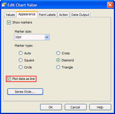
Figure 8. Drawing a data series as line in a column chart
To add a constant or dynamic target value to the chart:
- Design the chart.
- On the Data tab in the Chart Properties dialog box, add a new data value (for example, Target).
- Set
the target value (the example in Figure 9 uses a constant target
value of 100000 across all categories). Make sure to use an expression
starting with = (equals). Otherwise, the value is not interpreted as a
numeric value.
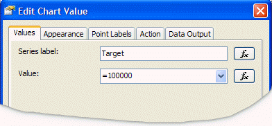
Figure 9. Adding a target value
The SalesCostTarget sample report (see Figure 10) uses this approach to add a simple sales target line to the chart.
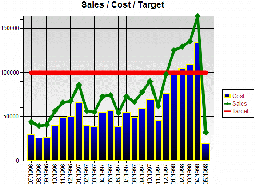 [ http://msdn2.microsoft.com/en-us/library/aa964128.moressrschartsfig10(en-us,sql.90).gif ]
Figure 10. Target value (red line) (Click on the image for a larger picture)
Note Since
lines for line chart series are drawn by connecting data points of
multiple categories, the line is only visible if the category grouping
has at least two distinct group instance values at run time.
Note If
the chart contains one or more series groups, the target data value is
repeated for every series group instance. This may be useful if you
have specific target values for every group instance.
If you only want one global target value for all series, you can dynamically set the target data value like this:
=iif(Fields!<SameFieldAsSeriesGroup>.Value = First(Fields!<SameFieldAsSeriesGroup>.Value, <ChartName>), <TargetValue>, Nothing)
A specific expression example could look like this:
=iif(Fields!Year.Value = First(Fields!Year.Value, "SalesChart"), 100000, Nothing)
Pareto Charts
A Pareto chart
summarizes and displays the relative importance of differences between
groups of data. Pareto charts distinguish the "vital few" from the
"useful many." A Pareto chart can also be defined as a column chart
with the columns sorted in descending order to identify the largest
opportunity for improvement.
While Pareto charts are currently
not directly supported in the built-in Reporting Services charts, you
can create a Pareto chart by using Reporting Services 2005 features and
writing some code. This section provides an in-depth explanation of the
ParetoChart sample report included with this white paper.
Following is the scenario description for the ParetoChart sample report.
The SQL Server 2005 AdventureWorks
database contains data about sales employees. In particular, we are
interested in analyzing the following information about our sales
employees:
- What does the Pareto analysis look like based
on the sales employees with the biggest previous year's bonuses? (See
the orange line in Figure 11.)
- Which sales employees
received the biggest bonuses last year and how does this compare to
their current year's total sales? (See the blue and green columns in
Figure 11.)
- Are there significant changes in sales
performance based on the previous year's bonus vs. the current year's
sales? While this can be answered by comparing the blue and green
columns, the huge gap between the orange and the red Pareto lines in
Figure 11 make it more obvious.
- For a particular sales
employee, we would like to drill into the past and present sales
performance and analyze historical trends over several years of data.
This
is achieved by adding drill-through actions on the sales data values
(green columns in Figure 11) to provide a detailed analysis on
individual salesperson's data with a trend analysis. The drill-through
report (MovingAverage sample report) is discussed in detail in the next section.
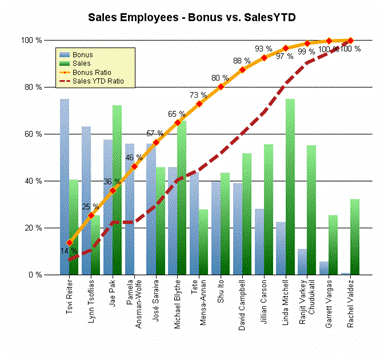 [ http://msdn2.microsoft.com/en-us/library/aa964128.moressrschartsfig11(en-us,sql.90).gif ]
Figure 11. Pareto chart sample report (Click on the image for a larger picture)
To build the Pareto chart report
- Define the query to retrieve the necessary sales data.
The query pre-sorts the data for each salesperson based on the bonus
values. It does not retrieve the individual sale orders because they
are not needed in this report. This also keeps the dataset size small.
- Design the overall chart layout.
Add a column chart to the report. To analyze the data per salesperson, add a category group based on the salesperson (group by =Fields!SalesPersonID.Value).
For the category label, show the first name and the last name of the
salesperson. This is achieved by setting the category group label
expression to the following.
=Fields!FirstName.Value & " " & Fields!LastName.Value
- Prepare the chart for the Pareto calculations.
We use the RunningValue(…) function for the calculations.
Note The RunningValue function is only supported in charts starting with Reporting Services 2005.
Similar to a matrix, the RunningValue
function needs an explicit grouping scope in a chart to determine if
the running value should run across all categories of a particular data
series (essentially the direction is horizontal) or if the running
value should run across all data series of a particular category (less
common).
For the Pareto calculations, we need to use a RunningValue
function that takes a series group name as its "reset" scope (and
thereby runs across all categories). Since we don't have yet a series
group for this particular chart, we can just add a fake series group based on a constant value (such as 1).
Group expression: 1
Label expression: ="" (to hide the series label from the generated legend labels)
This results in one data series and provides an explicit series scope name at the same time.
- Add the bonus and sales data values as columns.
We can add data values for Bonus and for SalesYTD to the chart by dragging the corresponding dataset fields onto the chart.
Note This example uses the Sum() aggregate function for bonus and sales values.
We
want to place the legend in the top left corner inside the chart plot
area. Hence, we want the y-axis to scale so that the maximum data point
value that is shown in the chart never exceeds 75 percent of the total
height of the y-axis.
We achieve this by scaling the bonus calculations by a factor of 75 percent:
=0.75 * Sum(Fields!Bonus.Value) / Max(Fields!Bonus.Value, "SeriesGroup")
We do the same for the sales calculation:
=0.75 * Sum(Fields!SalesYTD.Value) / Max(Fields!SalesYTD.Value, "SeriesGroup")
- Set up the y-axis as a percentage axis.
In the previous step, we set up the bonus and sales calculations as
percentage calculations (relative amount compared to the maximum
value).
Setting the format string of the y-axis to P0 applies
percentage formatting (the actual y-axis will be scaled between 0.0 and
1.0). To get nice intervals, we set the y-axis major interval to 0.2 to
set up 20 percent intervals.
- Add the bonus and sales Pareto calculations as lines.
The RunningValue() function provides a cumulative calculation
until it resets. We want it to never reset. Since we didn't have an
explicit series group initially, we added one in step 3.
The Pareto calculations are the cumulative sum divided by the
total values. For the bonus Pareto calculation, we use the following
expression.
=RunningValue(Fields!Bonus.Value, Sum, "SeriesGroup") / Sum(Fields!Bonus.Value, "SeriesGroup")
We do the same for the sales Pareto calculation:
=RunningValue(Fields!SalesYTD.Value, Sum, "SeriesGroup") / Sum(Fields!SalesYTD.Value, "SeriesGroup")
- Add a drill-through action on the sales data value.
To enable a drill-through analysis for the sales data of an individual salesperson, in the MovingAverage
sample report, we add a drill-through action (see Figure 12) on
the sales data point. Since we are only interested in one particular
salesperson, we set the SalesPersonID drill-through parameter to the value of the current category group. In this example that is the current salesperson ID: =Fields!SalesPersonID.Value.
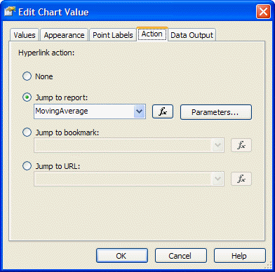
Figure 12. Adding a drill-through action
- Finish the chart by adding formatting, data point labels, and legend.
Moving Average Calculations
A
moving average is one of a family of similar statistical techniques
used to analyze time series data. A moving average series can be
calculated for any time series.
While moving average
calculations are not directly supported through the built-in Reporting
Services charts, you can often write code to perform this kind of
calculation. This section provides an in-depth explanation of the MovingAverage sample report.
The
sample report is related to the scenario described in the previous
section about Pareto charts. For a particular sales employee we would
like to analyze the past and present sales performance and analyze
historical trends over several years of data. Moving averages are used
to smooth out short-term fluctuations, thus highlighting long-term
trends or cycles.
The MovingAverage sample shows how to calculate a simple moving average (the unweighted mean of the previous n data points). In this particular example, we use the sales data for the previous three months. See Figure 13.
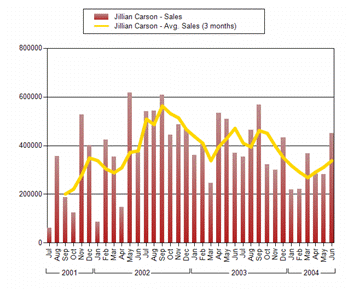 [ http://msdn2.microsoft.com/en-us/library/aa964128.moressrschartsfig13(en-us,sql.90).gif ]
Figure 13. Moving average calculation (Click on the image for a larger picture)
To build the report
- Define the query so that it retrieves the necessary sales detail data.
The query is parameterized to retrieve the data for only one
particular salesperson. The query parameter is set based on a report
parameter, which is populated with a dataset based a list of valid
values.
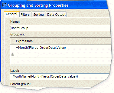
- Design the overall chart layout.
Add a column chart to the report. For the x-axis, use category mode
so that you can have two grouping levels: grouped by months at the
inner level and grouped by year with grouping spans at the outer level.
The month group uses the following explicit group label expression to
format the month as an abbreviated month name. =Format(Fields!OrderDate.Value,"MMM")
- Prepare the chart for the moving average calculation.
As in step 3 of the Pareto calculations, we use the RunningValue function. The moving average should not reset across the categories, hence we add a series grouping based on the SalesPersonID.
Since the query is parameterized based on the salesperson, there will
be only one salesperson series. The series group label expression is
set to =Fields!FullName.Value so the chart legend items will contain the salesperson's full name.
- Add the sales calculation as columns.
Drag the TotalDue dataset field onto the chart values drop zone to add a sales data value based on the Sum()
aggregation. To concatenate the word "Sales" to the series group label
(the group label is the salesperson's full name as defined in step 3),
we explicitly set the data value label to Sales.
- Add the moving average custom code functions.
The following table shows an example of a moving average calculation
by using a queue. The Queue Contents column shows the current queue
contents for a particular month. The last column of the table shows a RunningValue
calculation based on aggregating added and removed items from the
queue. The code sample below the table shows an implementation of this
algorithm.
Table 4
| Month | Sales | Moving average
(2 mon.) | Regular running value | Queue contents | Removed queue value | Running value based on queue |
Jan |
20 | n/a |
20 |
20 | n/a | 0 |
Feb |
10 | 15 |
35 |
20, 10 | n/a | 0+ 15 = 15 |
Mar |
24 | 17 |
59 |
10, 24 | -20 | 15+ (24-20) /2 = 17 |
Apr |
16 | 20 |
75 |
24, 16 | -10 | 17+ (16-10) /2 = 20 |
May |
12 | 14 |
87 |
16, 12 | -24 | 20+ (12-24) /2 = 14 |
… | | | | | | |
To implement the queue-based RunningValue, add the following code to the Custom code section on the Code tab in the Report Properties dialog box.
    Private queueLength As Integer = 3
    Private queueSum As Double = 0
    Private queueFull As Boolean = False
    Private queue As New System.Collections.Generic.Queue(Of Double)

    Public Function MovingQueue(ByVal currentValue As Double) As Object
        Dim removedValue As Double = 0
        If queue.Count >= queueLength Then
            removedValue = queue.Dequeue()
        End If
        queueSum += currentValue
        queueSum -= removedValue
        queue.Enqueue(currentValue)
        If queue.Count < queueLength Then
            Return Nothing
        ElseIf queue.Count = queueLength And queueFull = False Then
            queueFull = True
            Return queueSum / queueLength
        Else
            Return (currentValue - removedValue) / queueLength
        End If
    End Function
- Add the moving average sales value as a line.
The data value calculation for the moving average will use the RunningValue function over the values returned by the MovingQueue custom code function. The MovingQueue function calculates the adjustment values for the cumulative RunningValue calculation. This is done by using the following code.
=RunningValue(Code.MovingQueue(Fields!TotalDue.Value), Sum, "SalesPerson")
Note To
perform multiple moving average calculations within one chart, you must
either determine a way to reset the queue at the end of a series, or
use multiple queues. For example, you could use a hash table of queues
that are indexed based on the series group value, and passed to the MovingQueue function as an additional argument.
Note A chart cannot span multiple pages. Therefore, declaring the variables as private nonshared is valid.
To
use the moving average calculation in another data region (such as a
list, table, or matrix) that spans multiple pages, the variables must
be declared as shared (that is, static) in order to maintain state
across pagination. However, because this uses static variables, if two
people run the report at the same moment, there's a slim chance that
one will smash the other's variable state. If you need to be 100
percent certain that you avoid this, you can make each of the shared
variables a hash table based on the requesting user's ID (=Globals!UserID).
Custom Chart Color Palettes and Legends
Charts
use built-in predefined color palettes with 10 to 16 distinct colors.
Starting with Reporting Services 2000 Service Pack 1 (SP1),
you can override the default colors. To specify color values as
constant or expression-based values, click the Series Style button on the appearance properties for the data value in the Edit Chart Value
dialog box. You could use this, for instance, to highlight values based
on a certain condition such as a minimum or maximum value within the
current series.
Note If you don't want
to define a full custom color palette, you can override the color for
individual data points. Use an expression that either returns a
specific color value (in order to override) or returns "Nothing," which
will pick the current color from the underlying built-in color palette.
For
example, you want to highlight in red all data point values with
negative y-values. For all the other data points, you want to apply the
default colors. To do this, select Edit the data value and click the Appearance tab. Click the Series Style button, which opens the Style Properties dialog box. Click the Fill tab. Enter the following expression in the fill color style properties.
=iif(Sum(Fields!Sales.Value - Fields!Cost.Value) < 0, "Red", Nothing))
Note If you
set the fill color to a constant value, this color is applied to all
the data points for that data series.
The chart legend
uses color fields to match the legend items to the visible data points.
The legend can only show one color field per legend item (data series);
hence, it shows the color of the first data point within that series.
Remember this when you use expressions to dynamically determine the
color of individual data points within a series; the legend item always
shows the actual color of the first data point.
While the legend
built into Reporting Services charts is easy to use, it lacks
flexibility. For example, the legend consumes space within the chart.
If the legend is placed outside the plot area and the legend grows, the
chart plot area size shrinks accordingly.
You can get more
flexibility and control over the legend by generating your own custom
legend by using a table or a matrix. The easiest way to synchronize the
colors in the chart with your custom legend is to define your own custom chart color palette. The CustomColorPalette sample report implements a custom color palette and a custom legend. See Figure 14.
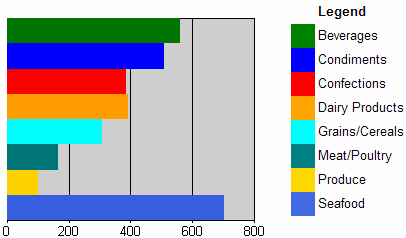
Figure 14. A bar chart report with a custom color palette and a custom legend
To build a custom color palette
- Define the chart series groups and category groups.
By default, every chart data series has a color assigned to it. This
color is based on the selected chart palette. In this example, we want
to override these colors based on the series group instance values.
- Define the custom color palette and add custom code.
The colorPalette variable stores the definition of our custom color palette, which has 15 distinct colors. The count
variable keeps track of the total count of distinct grouping values in
order to wrap around once we exceed the number of distinct colors in
the custom color palette. The mapping hash table keeps track of
the mapping between grouping values and colors. This ensures that all
data points within the same data series have the same color. Later it
is used to synchronize the custom legend colors with the chart colors.
The following code goes into the custom code window of the report.
    Private colorPalette As String() = {"Green", "Blue", "Red", "Orange",
"Aqua", "Teal", "Gold", "RoyalBlue", "MistyRose", "LightGreen",
"LemonChiffon", "LightSteelBlue", "#F1E7D6", "#E16C56", "#CFBA9B"}
    Private count As Integer = 0
    Private mapping As New System.Collections.Hashtable()
    Public Function GetColor(ByVal groupingValue As String) As String
        If mapping.ContainsKey(groupingValue) Then
            Return mapping(groupingValue)
        End If
        Dim c As String = colorPalette(count Mod colorPalette.Length)
        count = count + 1
        mapping.Add(groupingValue, c)
        Return c
    End Function
- Call the GetColor() function to assign colors to data points.
The GetColor function is called from the fill color style properties. Edit the data value to open the Edit Chart Value dialog box and click the Appearance tab (Figure 15). Click the Series Style button and click the Fill tab. The current series group value is passed as an argument to the GetColor function, which is needed to map the internal group instance value to the color value.
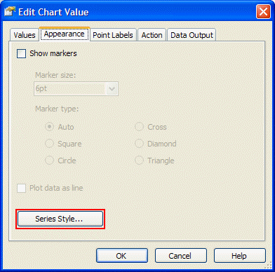
Figure 15. Specifying explicit data series styles
Note If
there are multiple chart series groups, you can concatenate the series
group values to create a unique identifier that is used inside the GetColor function. The following code is an example.
=Code.GetColor(Fields!Country.Value & "|" & Fields!City.Value)
- Add a chart legend.
You can use the built-in chart legend. Or, turn off the built-in
chart legend and follow the steps in the next procedure to build your
own custom chart legend with a table or a matrix data region.
To build a custom legend
- Add a table data region to the report.
Place the table next to the chart and bind it to the same dataset as the chart.
- Mirror the chart grouping structure in the table by adding table groups.
If the chart uses series groupings, add them to the table by adding
table groups that are based on the same group expression as the one in
the chart series groupings. Then add chart category groupings (if
present) as inner table groups.
In general, if the chart has m series grouping and n category grouping, you add m+n table groups for your custom legend.
For the individual table groups, make sure to show only the
group header (which will contain the legend description). Also, remove
the table detail row unless you want to use the table detail rows to
simulate a chart data table.
- Design the custom legend.
Add a rectangle for the color field of the custom legend. For
example, you might add it to the first table column. As indicated in
step 2, you should only have group header rows in the table. The
rectangle goes into the innermost group header level.
Set the rectangle BackgroundColor property to the
equivalent expression used on the chart data point's fill color. In the
most trivial case, the expression would just contain one grouping value
as in the following code.
=Code.GetColor(Fields!Country.Value)
For the legend text, use either the same expression as
in the category and series group/label expressions, or experiment until
you achieve the legend description text that you want.
Pie and Doughnut Charts
The Data Point Labels and Legend Labels section
describes how to set up inside and outside data point labels for pie
slices. This section covers a few additional properties of pie and
doughnut charts.
Unlike other chart types, a pie or doughnut
chart has only one "dimension of groupings" (that is, one data series).
To have two dimensions in pie and doughnut charts, the charts would
need to be stacked on top of each other.
Note During
report publishing, Reporting Services automatically converts the series
groups of a pie or doughnut chart into category groups to show the data
as one data series.
Pie charts are often used to show the relative percentages of data points. In general, the percentage value (which
can be used for example, for displaying as a data point label) can be
calculated by dividing the data point value expression by the total sum
for the entire chart. The following code is an example of this.
=Sum(Fields!Sales.Value) / Sum(Fields!Sales.Value, "SalesChart")
This expression is added as a data label expression as shown in Figure 16.
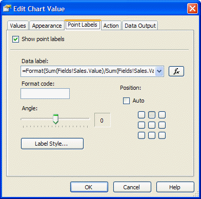
Figure 16. Data label percentage calculation
By default, pie slices have black borders that increase the visibility of the slices. However, as shown in Figure 17
in the next section, you can override the border with specific settings
for the data point appearance. If you want the border color to match
the pie slice color, you must use a custom color palette as discussed
in the previous section. Using a custom color palette you can set the
same color for the data point (pie slice) as for the border by making a
call into a custom code function that assigns colors based on the
category grouping value.
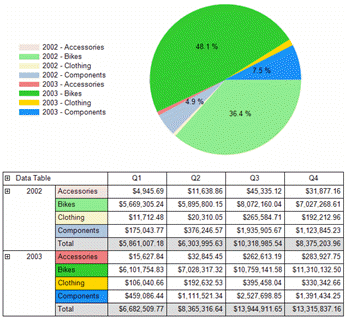
Adding Chart Data Tables
You
might want to add detail data to your chart. Adding data directly into
the chart may make the chart more difficult to interpret. Instead, add
the information in a data table.
A chart is a very effective way
to visualize the overall distribution of values and to identify
interesting areas (for example, very small and very large values). A
reader might want to analyze the information in more detail based on
the underlying detail data.
Reporting Services provides three ways of adding interactivity on chart data points as follows:
- Use a jump to report action to show
detail data by drilling to another report based on the current
series/category group values by adding these as drill-through parameter
values.
- Use a jump to bookmark action to jump to a section (such as a data table) within the same report.
- Use a jump to URL action to generate a hyperlink to an external navigation target outside the report.
Figure 17 shows a simplified version of the PiePercentage sample report included with this white paper.
 [ http://msdn2.microsoft.com/en-us/library/aa964128.moressrschartsfig17(en-us,sql.90).gif ]
Figure 17. Pie chart with custom formatting, custom color palette, and a data table (Click on the image for a larger picture)
To build a data table
- Create a pie chart with a custom color palette.
The pie chart in Figure 17 has two category groupings. The
outer grouping is based on the order year. The inner grouping is based
on the product category. The custom color palette is defined as
described in step 2 of the steps for building a custom color palette.
Since there are two category groupings, we use the following expression that generates a composite key, which is passed into the GetColor function.
=Code.GetColor(Fields!OrderYear.Value & Fields!ProdCat.Value)
If we apply the same GetColor function call to the
data point fill color property and to the data point border color
property, the pie slices won't show the default black border.
- Show data point labels for only those pie slices that
represent a share of the pie that is greater than 4 percent of the
total pie.
To achieve this, add the following function to the report custom
code section. The important part is to return a string with a blank
label for the pie slices that do not have labels—otherwise the chart
control will show the default label for that slice. (The default label
is the underlying data point value.)
Public Function GetLabel(ByVal currentValue As Double, ByVal totalValue As Double) As String
    If currentValue / totalValue < 0.04 Then
        Return " "
    Else
        Return Format(currentValue / totalValue, "P1")
    End If
End Function
The label expression for the data point calls the GetLabel function to calculate the percentage value/label.
=Code.GetLabel(Sum(Fields!Sales.Value), Sum(Fields!Sales.Value, "SalesChart"))
- Create a data table (matrix) for the chart.
The chart only shows aggregated sales data per year and product
category. In the data matrix, we would like to group the data in the
same way.
We add a matrix data region and bind it to the same dataset as the chart. We then add the OrderYear and ProdCat fields as row groups on the matrix, and aggregate the Sales values in the matrix cell. To add subtotals, right-click the group header cells in the matrix and select Subtotal from the context menu.
Note Clicking the small green triangle in a matrix heading selects the Subtotal
properties where you can explicitly set style properties for the
subtotal cells. For example, you could show subtotal cells with a
different background color to visually distinguish them from other data.
The
underlying dataset provides finer data granularity than what is shown
in the chart. We can take advantage of that in the data matrix by
adding another (inner) row group based on the subcategory, and the
quarter and month as matrix column groups.
- Add toggle drilldowns to the data matrix.
To add a drilldown effect for a particular group, right-click the group header and edit the group properties. On the Visibility tab in the Group Properties
dialog box, select the report item name that should toggle the
visibility of the current group. Typically you select the report item
name of the text box in the parent group. If there is no parent group,
you could add a text box to the matrix corner and use it to toggle the
outermost grouping level in the matrix.
The Initial visibility option, which sets the initial toggle state is also set on the group Visibility tab. Setting this option to Visible means that it is initially expanded and Hidden means it is initially collapsed.
- Adjust the initial toggle image and the toggle state.
If the initial toggle visibility state of a group is set to Visible, the toggle image on the report item that toggles this group may show a plus sign (+). To display the minus sign (-)
toggle image instead, right-click on the report item that toggles the
group; this is usually the text box in the parent group's header.
Select Properties from the context menu. In the Textbox Properties dialog box, select the Visibility tab and set the initial appearance of the toggle image. Since the group toggle visibility is set to Visible, the initial appearance of the text box should be set to Expanded (-) as shown in Figure 18.
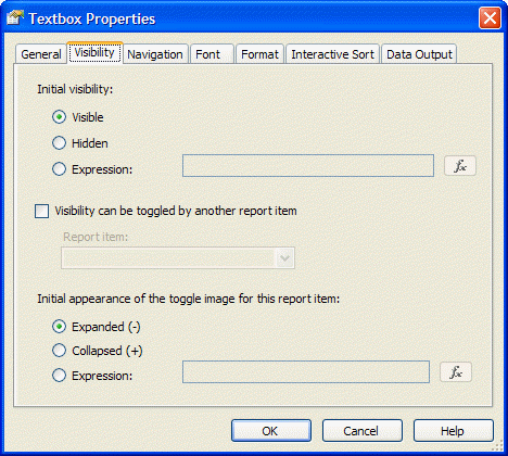
Figure 18. Adjusting the initial appearance of the toggle image
- Add bookmarks to connect the chart and the data matrix (optional).
Enabling bookmark navigation from chart data points to the data
matrix involves two steps. First, define the bookmark IDs within the
data matrix. Second, define the jump to bookmark navigation action on
the chart data point.
To add bookmarks in the data matrix, right-click the group header of the order year row group and select Properties from the context menu. In the Textbox Properties dialog box, select the Navigation tab and define the Bookmark ID expression by using an expression that generates a string: =CStr(Fields!OrderYear.Value). This provides our bookmark jump targets.
Open the Chart Properties dialog box and edit the data point properties. On the Action tab, select Jump to bookmark, and use the same expression as was used for the bookmark ID.
Scatter and Bubble Charts
Scatter
and bubble charts are different from other chart types because, instead
of using the category grouping values as x-values, they have explicit
x-values for the data points. Consequently, the data can be grouped
(and aggregated) into a different category than the value that is shown
on the x-axis. For example, to show last year's sales for individual
salespersons along the x-axis, you would not want to aggregate y-values
if two salespersons have identical x-values. The BubbleChart
sample report (Figure 19) has a category grouping based on the
salesperson so that it aggregates sales data per salesperson. However,
the value of last year's sales is shown on the x-axis.
Note It
is very important that you understand the distinction between the
x-value property of the data point and the grouping of the chart data
based on series and category groups. If you design a scatter or bubble
chart and it only shows one data point in preview, but you expected
many different points to be shown, the most likely explanation is that
no category groups or series groups have been defined. If no category
groups and series groups are defined, the underlying dataset rows are
aggregated up into one data point with a specific x-value and y-value.
In some cases, you could define a category or series group expression
that is identical to the x-value expression, but in a scatter or bubble
chart you rather want to add a category or series grouping based on
what the data represents. If the chart aggregates sales values for each
salesperson, the category or series grouping should be based on the
salesperson's ID or name as shown in the BubbleChart sample report.
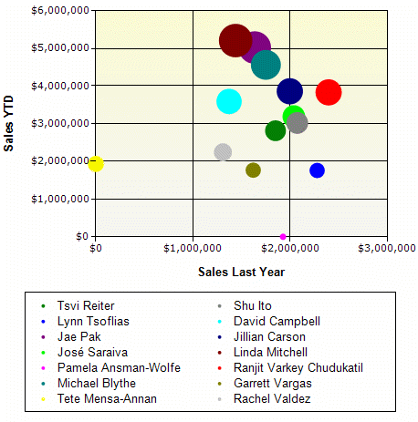
Figure 19. Bubble chart with series data grouped by salesperson
Another useful scenario for scatter charts is in the StepFunctionChart
sample report. The scatter line chart uses a category grouping based on
measurement IDs. For certain days, shown as x-values, there are
multiple measurements in the dataset, shown along the y-axis, resulting
in vertical steps.
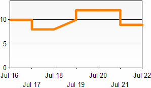
Figure 20. Scatter chart based on, for example, sensor measurements
Table Inline Charts
Sometimes
you have an unknown amount of data at runtime and you want to
dynamically "grow" the charts in size. One way to achieve this is to
embed a chart in another data region's group. For instance, you could
use a list data region with a detail group based on the following
expression.
=Ceiling(RowNumber(Nothing)/20)
This
results in one group for every twenty detail rows. Embedding a chart
inside that list creates chart instances at runtime for every twenty
rows.
To create an inline bar visualization of data, you can use two different implementation approaches:
- Embed an image that has dynamically calculated
right padding values (see Figure 21). Adjusting the right padding
of a static image achieves a bar chart effect as the result of
dynamically stretching the image.
- Embed a bar chart that has a calculated y-axis maximum value (see Figure 23).
- Both approaches are implemented side-by-side in the TableInlineCharts sample report.
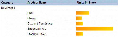
Figure 21. Table inline chart simulated by an embedded image and dynamic padding
To implement inline visualizations based on embedded images
- Design an embedded image that will be used for the "bar" visualization.
A simple gradient image usually looks nice. Add the image as an embedded image to the report.
- Add a table to group and visualize the data.
Design the grouping structure of the table. You can either place the
image visualization into a group header or into the table detail row.
Add an embedded image in a new table column. Select the embedded image
from step 1 as source of the image.
- Calculate the right (or left) image padding.
Create an expression for the right (or left) padding property of the
image report item. The expression divides the numeric value to be
visualized by the maximum value. Then multiply the relative size by the
width of the table column as defined in step 2. You may also want
to consider using the Math.Min or Math.Max functions to restrict the padding to a certain range if needed.
In the TableInlineChart sample report, the table column
has a width of 2 inches. For the padding calculation we use the
points measurement unit; there are 72 points per inch. Hence,
assuming we set the left padding to 0 points, there is a 144-point
range for the Right Padding option. The following code sets up the padding.
=144 * (1.0 - Fields!UnitsInStock.Value / Max(Fields!UnitsInStock.Value, "DataSet1")) & "pt"
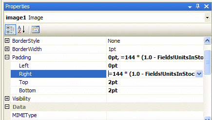
Figure 22. Dynamically calculating the image right padding size
- Set the image sizing property to Fit.
The padding defined in the previous step determines how much space
is available for the image to stretch, thus generating the bar
visualization effect.
One drawback of the embedded image approach is that
the image might stretch if you use fonts or thin lines in the image.
Using a chart for the inline visualization (Figure 23) provides
more control over the visualization and often better results.
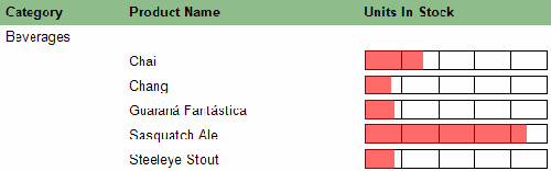
Figure 23. Table inline chart based on a chart embedded in the table group header
To use a chart for inline visualization
- Add a table to group the data.
Design the grouping structure of the table. Keep in mind that charts
can only be placed into the table header or footer or into the group
header or footer.
- Add a new table column and place the chart into a group header.
To maximize the chart plot area for the bar visualization apply the following chart properties settings.
General settings: Set to bar chart, turn off the legend.
Data: Bind the chart to the same dataset as the parent table; add a data point value based on the value to be visualized.
X-axis: Turn off axis labels, turn off gridlines, set the tick marks to None.
Y-axis: Turn off axis labels, set the tick marks to None,
set the maximum to the maximum value calculated in the scope of the
containing table or the dataset. This is needed to achieve correct bar
sizes; otherwise every chart instance would just auto-scale the y-axis
based on the data values for that particular group.
- Refine the chart visualization (optional).
Experiment with chart plot area style settings, y-axis major
gridlines, 3D effects, or dynamic color settings to further refine the
inline chart visualization.
Chart Extensibility and Creating Charts Manually
This
white paper provides information on tweaking chart settings and
extending the existing chart capabilities with expressions and custom
code functions. Beyond that, there are additional approaches to
integrate more advanced chart functionality into Reporting Services:
- Integrate chart images generated by custom assemblies.
- Implement chart extensibility based on the new custom report item feature of Reporting Services 2005.
- Use
third-party Reporting Services 2005 add-in components, which
provide enhanced chart functionality. These are based on the custom
report item feature.
To integrate images generated by custom assemblies
- Design and implement a custom assembly to generate images.
The custom assembly must retrieve the data on its own, take care of grouping/sorting the data, and generating the chart image.
Note The custom assembly has to return the image as byte[]. It cannot return it as a System.Drawing.Image. You can often convert a System.Drawing.Image object with code similar to the following.
System.IO.MemoryStream renderedImage = new MemoryStream();
myChart.Save(renderedImage);
renderedImage.Position = 0;
return renderedImage.ToArray();
- Add an image to the report.
Set the image type to Database. If the generated image is a bitmap in the PNG image format, set the image mimetype property to "image/png." For the image value property, use an expression like the following.
=MyCustomAssembly.GenerateChart()
- View the report in Report Designer Preview view to verify that the report is working correctly.
Note In a default configuration, custom assemblies run in FullTrust
in Report Designer preview. Hence, operations that require certain code
access security permissions (such as file input/output, data provide
access, etc.) are automatically granted these permissions in FullTrust.
- Deploy the custom assembly on a report server.
Make sure that the security policy configuration of the report
server grants sufficient permissions to your custom assembly at
runtime; otherwise the image generation will fail. For more
information, see
Understanding Code Access Security in Reporting Services [ http://msdn2.microsoft.com/en-us/library/ms155108.aspx ] in SQL Server 2005 Books Online.
Charts Based on a CustomReportItem Compared to Custom Assemblies
There
are several benefits of using the custom report item feature over the
custom assembly approach. First, you can build your own design-time
support component that will integrate directly into Report Designer.
Second, at runtime you can take advantage of the Reporting Services
processing engine to retrieve the data and apply grouping/sorting and
filters. The CustomReportItem runtime control will access the
processed data and generate a chart image with an interactive image map
and associated actions.
Carefully study and review the documentation and samples before building your own CustomReportItem. More information is available at the following sites:
Conclusion
This
white paper provides tips and insights on the charting functionality of
Reporting Services that have not been previously covered in books,
other articles, papers, or presentations. It also covers how and when
to use certain functionality options.
The white paper presents
and thoroughly explains a set of report examples that demonstrate how
to get more out of the built-in Reporting Services charts when working
in particular scenarios. For instance, it describes how to add a Pareto
analysis or calculate moving averages.
Finally, the paper
briefly discusses Reporting Services extensibility that you can use to
integrate external (charting) functionality into your reports.
About the author Robert M. Bruckner
is a Software Development Engineer with the Microsoft SQL Server
Business Intelligence group. His main area is the data and report
processing engine of SQL Server Reporting Services.
For more information:
http://msdn.microsoft.com/sql/bi/reporting/ [ http://msdn.microsoft.com/sql/bi/reporting/ ]